Sunday, 3 June 2012

The Photography of Lee Friedlander

 Washington DC, 1999

 Las Vegas, 2002
Lake Louise, 2000

“How we think shows through in how we act. Attitudes are mirrors of the mind. They reflect thinking”. –David Joseph Schwartz.

Lee Friedlander is an American photographer and artist. He was well known in the 1960’s and 70’s working mainly with 35mm black and white film.[i] He referred to his style as “social landscape” with most of his photos including reflections, and unique framing. Some of my favourite photos include: Washington DC, Las Vegas, and Lake Louise. He obviously titled the photos with the locations they were taken. Lee Friedlander is a great photographer because of his unique perspective.
            The photo, “Washington DC” was taken in 1999 for his “American Monument” project.[ii] This project was one of his later works and documents how memorials in the United States have many changing landscapes. His unique style calls attention to these monuments and the new surroundings that have developed over the years. In the photograph you can see the tip of the Washington Monument in the background through his car window. The photo is sectioned into three section horizontally; one including a car mirror with a reflection of town buildings behind the car, the middle section including a street view with trees and a pedestrian, while the last section includes part a transparent car window. This unique segmentation creates a very unusual photo, which takes some time for the viewer’s eye to take in. The idea of a photograph showing a monument and its surroundings intrigues me, although years have passed and the environment has changed, the symbol of the monument is still there. This beautiful photo shows the contrast between old and new and how symbols last forever.
            The photo, “Las Vegas” was taken in 2002 from his “America by Car” project. This whole project was shot on the road throughout America in various Fords, Chevrolets, and Toyotas to symbolize an “everyday American.”[iii] About half of the photo is taken up by the interior of Friedlander’s car. In the background is the famous Las Vegas skyline including the replica of the statue of liberty. There is a stoplight pole acting as a merger across the skyline, but it adds to the unique perspective by dividing the photo into even more irregular sections. Finally, which is common in most of his photographs you see a reflection of pedestrians crossing a bridge in the distance in his car mirror. Again this unique style shows well-known monuments in a different light.
            His photo, “Lake Louise” was taken in Alberta, Canada in 2000.[iv] It is very different than the previous two photos. Although it does not include his signature car mirror reflections, it obviously still follows his interest in reflections. This is one of my favourite photos of his. It is a simple landscape, yet the use of the reflection makes it almost abstract. The photograph is of two snow-capped mountain peaks reflecting into the lake creating a very intriguing hourglass shape. He also included a pile of boulders in the foreground emphasizing a very clear use of the rule of thirds. This photo uses his unique reflection to create a beautiful photograph.
            In conclusion I think Lee Friedlander was an amazing photographer whose unique eye, and interest in reflections gave a deeper meaning to each photo he shot. My three favourite photographs of his: Washington DC, Las Vegas, and Lake Louise are all very different but are obviously his style with the quirky framing and reflection. Lee Friedlander’s unique perspective made him a great photographer.

Works Cited
"Lee Friedlander Biography." Metro Artwork. 2012. Web. 1 June 2012. <http://metroartwork.com/lee-friedlander-biography-artwork-m-76.html>.

"Lee Friedlander." Museum of Contemporary Photography. Web. 01 June 2012. <http://www.mocp.org/collections/permanent/friedlander_lee.php>.

"Objects in the Mirror Are Closer than They Appear." Photourbanism. Web. 03 June 2012. <http://www.photourbanism.co.uk/2010/11/25/objects-in-the-mirror-are-closer-than-they-appear/>.

"A Sly Virtuoso." The New York Times. The New York Times. Web. 03 June 2012. <http://www.nytimes.com/2005/06/03/arts/design/03kimm.html?pagewanted=all>


[i] Metro Artwork
[ii] MoCP
[iii] Photourbanism
[iv] New York Times


1/100, F7.1, ISO 200

I took this photo to emulate Lee Friedlander's work. I am quite happy with the result. It was taken out of the window of my car to create the unique framing style he has as well as copy his many projects taken out of car windows. In the background you see farmland which is under development, and in the reflection in the side mirror you see a newly developed subdivision. What I think is interesting about this photo is at the bottom of the mirror in the reflection you see "objects in mirror are closer than they appear". This is almost eerie in representing how the farmland you see in the background will soon be developed into yet another housing plot. I think this emulated Friedlander's work very well because it uses both his quirky style, and conveys a message to the viewer using the reflection. I am very happy with this photo!

Friday, 1 June 2012

Gel Medium Transfer


FOR SOME REASON THE SCANNER MAKES THEM LOOK LIKE THEY STILL HAVE PAPER ON THEM BUT THEY DON'T I PROMISE!

Anyways, I think this process was really cool to do, but involved a lot of patience. The outcome was an ink photo transferred onto the glue-like substance. It is a really great process which allows you to stretch and play with your transparent photo (like a fruit roll-up yay). I used 18 layers on each photo which took me 3 days! This was fairly easy, but required tons of patience... which I lack. I did enjoy the outcome though!

Friday, 18 May 2012

Music For The Eyes


A Rayogram is a photo created in the darkroom by placing objects on a piece of photo paper and exposing the paper. This creates a unique effect and allowed me to play with different textures to see what effect they would have on the photo. In the end I came up with the theme of "Music For the Eyes". I used various items such as pipe cleaners, lined paper, earbuds, and cotton. I tried a few times to get my final product and am happy with the outcome. The picture is a clear representation of the theme and I really like it! What I find the most interesting is the effect the lined paper had. It created a really cool effect with my music notes which make them seem almost "ghostly". This was a very fun process to experiment with!

Fun With The Sun

Original photo
1/200
f 11

Cyanotype


I took this picture while on a trip in Boston. The angle of which I took this photo is unique and almost like an optical illusion. The cyanotype process was very unique and nothing like I have ever done. It is similar to developing a photo in a dark room but uses the sun! After the process is complete the photo is blue and white and kind of textured. It almost gives off a feel of an older photograph with a grain-like texture. I think this process creates a very unique and pretty photo. I really enjoyed it!

Monday, 7 May 2012

Being Told To Break The Rules

I found this project quite interesting to do. It's harder than I thought it would be to not follow the rules of photography, which now come naturally to me. For all of these photos I used my Canon Rebel XS. 
 Shutter Speed: 1/15
Aperture: 4.0
ISO: 800
I captured this photo of my sister in a cafe without her noticing. There are quite a few things wrong with this photo, the most obvious being that she (the subject) is not in focus, but the table behind is. There is also a plant behind her head which is acting as an obvious merger. The whole setup of this photo is off, and it barely follows the rule of thirds. Although it has all of these negative aspects, I think it's still an interesting photo!

  Shutter Speed: 1/250
Aperture: 5.9
ISO: 100
I took this photo while I was away on March Break in Florida. The flowers at the bottom of the photo are out of focus, and act as a merger blocking the lake. The whole photo just isn't very symmetrical, and feels off balance. Again, these broken rules create an interesting photo to look at. 


 Shutter Speed: 1/200
Aperture: 10
ISO: 200
This photo breaks the rules of photography because it doe not follow the rule of thirds. My subject is almost directly in the center of the photo, and my horizon line as well. This makes the photo really awkward to look at because it just feels "off". Also, the trees in the background act as a merger coming out of my subjects head. This photo breaks many different rules!

Sunday, 29 April 2012

Some Modern Renaissance

Vanessa as Goddess of Venus
Original "Birth of Venus"


The French term ‘Renaissance’ emerged in the 19th century and was used to describe an entire period of rebirth, occurring between the 14th and 17th centuries (the renaissance). Artists of this time looked back to those before them while incorporating a greater sense of light and color through new mediums.  The use of space and perspective was a huge innovation of this time. Paintings were no longer two-dimensional but took on the illusion of having three dimensions. Art during the Renaissance was mostly made for commissions or religious reasons. It is said that by the end of the 15th century, contracts concerning commissions specified that most of the painting must be done by the masters’ hand. It was the work of the master that brought with it the most money and prestige. The Renaissance proved to be a time of great transformation of the artist as they came to occupy a different place in society, for art was becoming more than just a craft. Renaissance society was dominated by guilds, which represented the important trades in the city. All were connected to a patron saint and each looked out for their fellow members, ensuring that all had a job and a decent income. Workshops were also abundant, where a master paid to take on an apprentice to teach practical skills in the field. As a cultural movement, it encompassed a revival of learning based on classical sources, the development of linear perspective in painting, and gradual but widespread educational reform. Traditionally, this intellectual transformation has resulted in the Renaissance being viewed as a bridge between the Middle Ages and the Modern era. 
The artist I chose to research about was Allessandro Botticelli. He later took on the name of Sandro Botticelli and was an Italian painter (like Zanini) who was born in 1445. He painted during the early renaissance. His best known works include The Birth of Venus and Primavera. His painting career started fairly late for the era at the age of 18 (so old!). He is one of, if not the first artists to paint subjects who were not religious characters or portraits (mythological or allegorical). This was unheard of during this time and makes him stand out as an artist in the renaissance. He started by mimicking the paintings of his master Fillipo Lippi. His paintings often included pale and muted colours, flowing garments, with faces full of life and beauty. This was a technique he adopted from his mentor but soon adapted it to be his own.
          With this technique he created the famous painting, The Birth of Venus.  This painting is one of my favourite from the renaissance era. The colours are bright and warm, and the face of the subject (Venus) is serene and innocent. The overall painting is very somber and calming. The paining includes a nude subject, which was an innovation of the time, and was very shocking to some people since unclothed figures had been prohibited during the Middle Ages. 

Monday, 9 April 2012

Painting With Light


This photo was a lot of fun because I had never really tried anything like this before. It took a while to get used to shooting in the dark, as well as learning different techniques you could use in order to get a different photo. Here is my model Vanessa as an alien. I used my Canon Rebel XS with a shutter speed of 30 seconds and an aperture of 5.6. I think this photo is unique, and has an interesting effect with the blue light. As you can see, I learned that holding the light in one spot for a long period of time created a cool effect which looks like stars. This was difficult because I had to keep my hand still, but had to keep moving my body to avoid being in the photo. I initially used the blue light to shade in Vanessa so I could see my subject, and then added the extra things like stars and her cute antenna's. I think this photo turned out really well and I had fun with this project. Now you know Vanessa's an alien, but that's a secret...SHH.

Saturday, 7 April 2012

Studio Lighting


I really liked this project because it gave me the chance to experiment with different types of studio lighting. It was definitely harder than I thought it would be, but I think I finished with some pretty great shots! To shoot these photos I used my Canon Rebel XS, with my basic 18-55mm lens. For the first photo I used a shutter speed of 1/50 and an aperture of 5.0. I attempted 2:1 ratio lighting by placing two lights on her left and one on her right. This gives a great look to any photo if done correctly and I am very pleased with my results. For my second photo I used a shutter speed of 1/50 and an aperture of 5.6. I used similar lighting as the first photo, but made Alicia pose looking to one side so I could get a profile shot. I really like this photo because the lighting causes a shadow to fall along her jaw bone, accentuating it. For the last photo I used a shutter speed to 1/30 and an aperture of 4.5. I used pretty balanced lighting in this photo with one light on each side. Overall, I had a lot of fun with this. I took many photos and the 3 I chose I obviously liked the best. Alicia and I had a lot of fun shooting this and I was probably inspired the most just by the joking atmosphere we had. We were goofing around just taking a lot of silly photos while experimenting with the different lights and seeing what would happen if we moved each one. We had fun and I shot some great photos in the process!

Sunday, 25 March 2012

Playing with mixed lighting


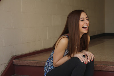
This assignment was to take photo involving mixed lighting, so daylight combined with an added light source. I took this photo of my lovely model Vanessa using my Canon Rebel XS. The shutter speed was set to 1/60 and the aperture was 7.1. I used a basic 18-55mm lens. This photo includes natural light from the window outside, a fill light with the school lights above, and I used a reflector sheet to bounce the outdoor light onto the other side of my subject. I think this is a beautiful candid shot because I caught her laughing. The yellow light from outside mixed with the white light of the interior creates a joyful mood to this photo. I was obviously inspired by the gorgeous weather outside to create this happy photo. I had fun experimenting with mixed light and think I had a great outcome!

Tuesday, 20 March 2012

New Perspective

This project challenged us to find our name in the world around us. This gave me the opportunity to become more creative and forced me to look around me in a way I hadn't before. This project was a great exercise to help train myself to always look for something more in a photo. I edited the finished project so that all of the photos had similar colour tones and would look more like one cohesive photo. I really enjoyed this project because it let me explore a more creative side of myself!

Friday, 2 March 2012

Who inspires me?


(The above photo set is called "Fantastic Voyage" by Slinkachu.)


I recently came across a photographer by the name of Slinkachu who has been working on a project which he calls "little people" for five years now. I find his work so interesting! He uses small figurines and creates a scene in an ordinary setting and creates a unique photo which tells a story. He usually has photos in sets of 2 or 3 photographs starting with the intended scene, and slowly zooming out to see the "ordinary" scene it took place in.

He intended this project to make people more aware of their surroundings. I love this idea because it reinforces the idea that with photography you can make even the simplest of things interesting. In his biography he says that "the scenes I set up, and the titles I give these scenes aim to reflect the loneliness and melancholy of living in a big city, almost being lost and overwhelmed." I think his work inspires me because it proves the well known quote "beauty is in the eye of the beholder". He takes things you would see every day on the side of the road and turns them into an interesting photograph! Visit his website or his blog to see all of his photos and to learn more about him!